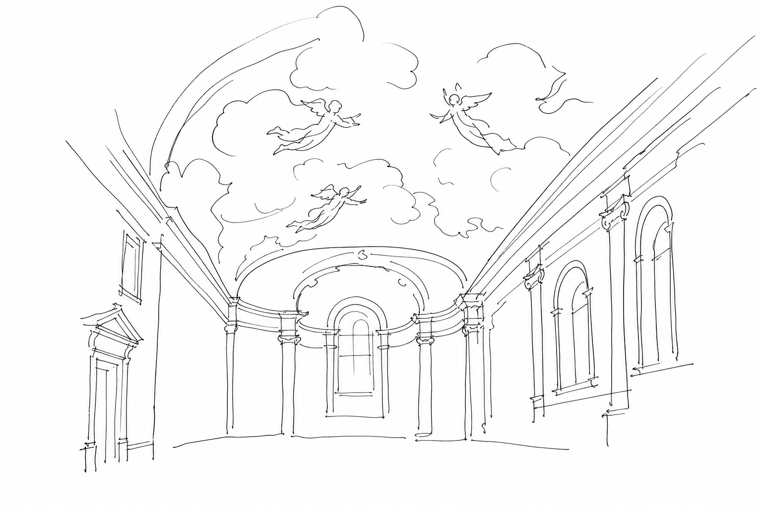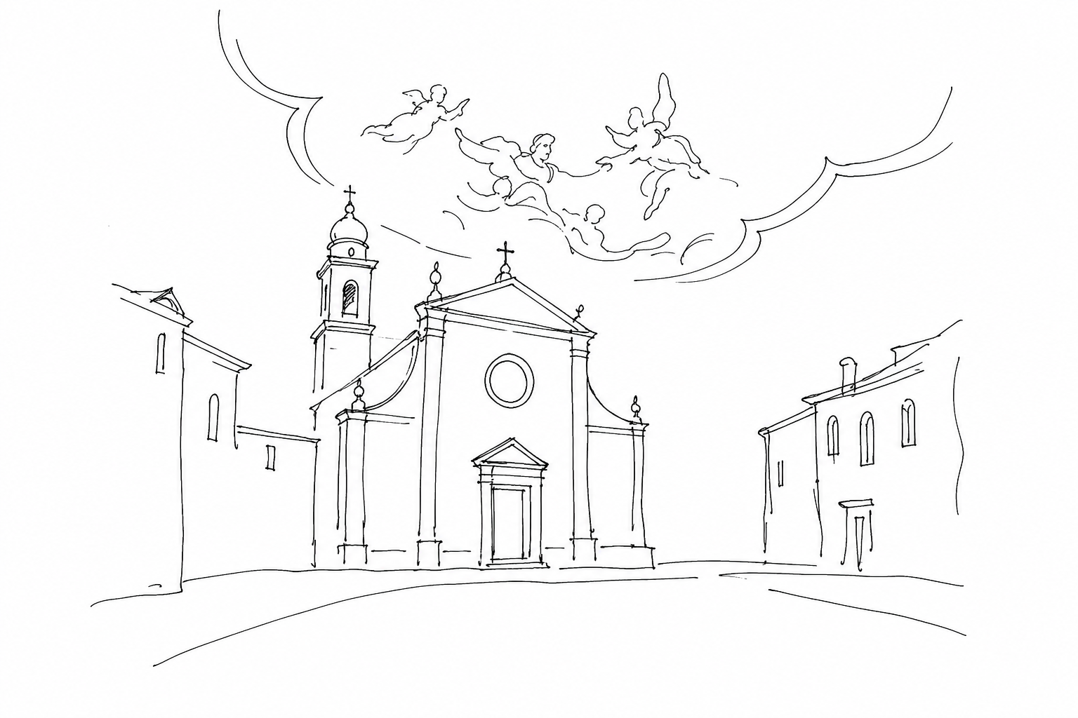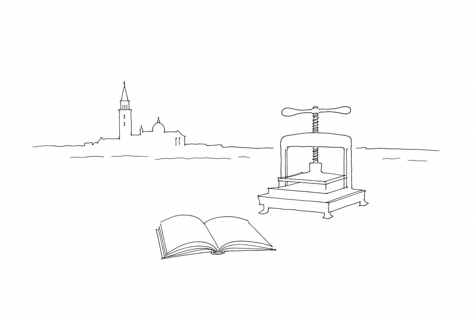

Before becoming a destination to be crossed with maps and itineraries, Venice was a city where ideas circulated with surprising speed. At the end of the fifteenth century Aldus Manutius chose this space of water, workshops and trade to change the form of the book: smaller, more manageable, closer to the everyday gesture of reading. His story concerns not only typography, but also the way in which a city can transform knowledge into an urban object, made of paper, typefaces, workshops, relationships and movement.
Why Venice in particular
At the end of the fifteenth century Venice was the ideal place to transform the book from a rare object into a companion for travel and study. The city brought together mercantile capital, Mediterranean routes, a network of paper mills in the hinterland and a learned demand fueled by patricians, officials, clergy, doctors and students. Here Aldus Manutius found not only clients, but also practical tools: credit, distribution, specialized craftsmen and a market accustomed to circulating light and precious goods.
The context was also decisive on the linguistic level. After the fall of Constantinople, Venice welcomed Greek manuscripts and scholars; Manutius was therefore able to work on classical texts with a philological attention rare for the time. His workshop became a meeting point for humanists, proofreaders and type engravers, leading to the collaboration with Francesco Griffo for italic type.
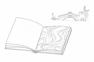
In a city made of landing places and exchanges, the small format of the Aldine enchiridia made sense: manageable books, less expensive than large volumes, suitable for being read, transported and owned even before modern cultural tourism existed.
The format that changed the way of reading
Aldus Manutius’s turning point was not only printing good texts: it was redesigning the physical relationship between reader and book. From 1501, with editions such as the Virgil, his Venetian workshop made the octavo format famous, obtained by folding the sheet until small, light volumes that were easy to hold in the hand were produced. They were not yet “paperbacks” in the modern sense, but they anticipated their essential idea: to carry an author with you, read him outside the study, own him without the monumentality of the humanistic codex.
These enchiridia, that is, “hand” books, also changed the appearance of the page. Manutius reduced bulky apparatuses, favored compact texts and entrusted Francesco Griffo with elegant and small typefaces, including Aldine italic, designed to take up less space without losing legibility. The result was a Latin or Greek classic that did not intimidate like a large desk volume.
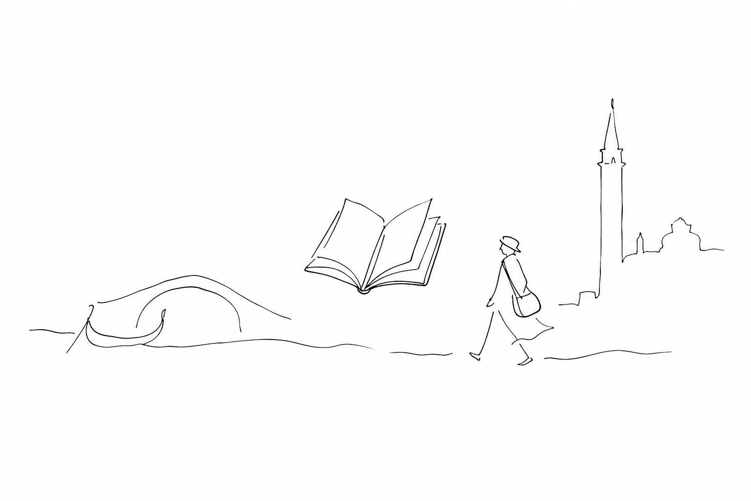
Before travelers sought Venice as a capital of culture, Manutius had already imagined a mobile reader: student, diplomat, learned merchant, traveling humanist. The book became a personal, almost everyday object, and Venice the laboratory in which reading left libraries to enter practical life.
Workshop, authors and the anchor mark
The Aldine enterprise was also a network of people and recognizable signs. Compositors, proofreaders, type engravers and scholars capable of discussing a Greek variant as well as a typographical choice worked in the workshop. Around the publisher gathered the Aldine Academy, a humanistic environment where the ancient text was collated, emended and prepared for more reliable printing.
Among the collaborators, Pietro Bembo stands out, decisive for linguistic and literary taste, and Erasmus of Rotterdam, who published the Adagia in an expanded version at the workshop. Francesco Griffo, an engraver from Bologna, contributed elegant and legible typefaces: Aldine italic, created to save space without losing clarity, became one of the most imitated features of European publishing.
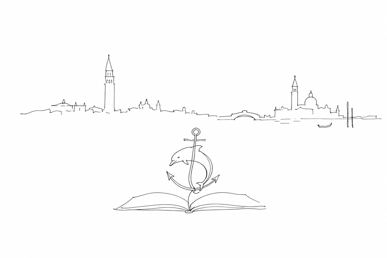
The most famous sign remains the anchor with the dolphin, accompanied by the motto Festina lente, “make haste slowly.” The anchor alludes to steadiness, the dolphin to speed: a perfect synthesis of the Aldine method, quick in disseminating the classics but prudent in philological care. That mark transformed every volume into an identifiable object, guaranteed by a precise idea of quality.
Reading Venice after Manutius
To recognize his legacy it is not enough to look for a plaque: one must observe how a text sits in the hand. The octavo edition, smaller than large desk volumes, made the classics transportable along calli, fondaci and trade routes. It was a cultural technology designed for students, diplomats, learned travelers and private readers, long before the city became a destination for literary tourism.
A practical key is to look at three clues: the airy page, the slanted type engraved by Francesco Griffo to save space without losing elegance, and the more regulated punctuation, useful for reading silently. In historic libraries, such as the Marciana, Aldine editions show this revolution concretely: not monuments, but small objects, born to circulate.
Thus the Serenissima can also be read through a simple gesture: opening a manageable volume and understanding that the modernity of reading also began with the size of the page.
Following the traces of Aldus Manutius in Venice means reading the city beyond its best-known façades: in the calli where printers and proofreaders worked, in the graphic signs that became memory, in the modern idea of a book to carry with you. His legacy is not an isolated monument, but a different way of looking at Venice: as a place of cultural production, not only of contemplation. Even a short walk can thus become a route among matter, word and ingenuity.
Related Posts
Italic type was also born here: Venice, publishing and typefaces that changed the way people read
How Venice, Aldus Manutius and Aldine typefaces changed books, reading and the printed page.Decorated Paper in Venice: Marbling, Bindings and the Tactile Side of Printing
A journey through Venetian decorated paper, among marbling, bindings, workshops and books to be observed with eyes and hands.
Marbled paper in Venice: colors on water and workshops that seem like alchemy laboratories
A short journey through the history, technique and Venetian workshops of marbled paper, where pigments, water and slow gestures become objects of use and memory.Questions Answered
Why was Venice ideal for Aldus Manutius's innovations?
It combined mercantile capital, trade routes, skilled craftsmen, and scholarly demand.What was revolutionary about Aldus Manutius's book format?
He created small, portable octavo volumes making texts easier to read and carry.Who were key collaborators in Manutius's workshop?
Francesco Griffo with italic type, Pietro Bembo for literary taste, Erasmus of Rotterdam.What does the Aldine anchor and dolphin symbol represent?
It symbolizes balance of speed and steadiness in producing quality books.
Venice through books and trades
Would you like to follow details showing how the city changed the way books were made and read?
 Italic type was also born here: Venice, publishing and typefaces that changed the way people readHow Venice, Aldus Manutius and Aldine typefaces changed books, reading and the printed page.
 Decorated Paper in Venice: Marbling, Bindings and the Tactile Side of PrintingA journey through Venetian decorated paper, among marbling, bindings, workshops and books to be observed with eyes and hands.
 Marbled paper in Venice: colors on water and workshops that seem like alchemy laboratoriesA short journey through the history, technique and Venetian workshops of marbled paper, where pigments, water and slow gestures become objects of...
 The Marciana Library: books, painted ceilings and public knowledge next to San MarcoEditorial guide to the Marciana Library: history, rooms, books, paintings and public role in the heart of San Marco.