
Ca’ d’Oro is not only one of the most recognizable palaces on the Grand Canal: it is an effective way to understand how Venetian Gothic works when it encounters the water, light and urban life of the city. Its façade, today without the gilding that gave it its name, preserves a pattern of arches, loggias, tracery and apparent imbalances that tell much more than a decorative style. Looking at it carefully means reading a page built in stone, open towards the canal and designed to be seen from afar, in motion, within the changing rhythm of Venice.
Why Ca’ d’Oro is a lesson in Venetian Gothic
Seen from the Grand Canal, Ca’ d’Oro immediately shows why Venetian Gothic is not a simple medieval import, but a language born from the city’s water, light and trade. The façade, built in the fifteenth century for the Contarini family, does not rely on the compact mass of the palace-fortress: instead, it prefers a perforated, rhythmic, almost textile surface.
The name derives from the ancient gilding that once decorated parts of the front, together with colors that are now lost or softened. Even without that original effect, the palace preserves a precious quality: it seems to become lighter towards the top thanks to the loggias, pointed arches and slender marble columns.
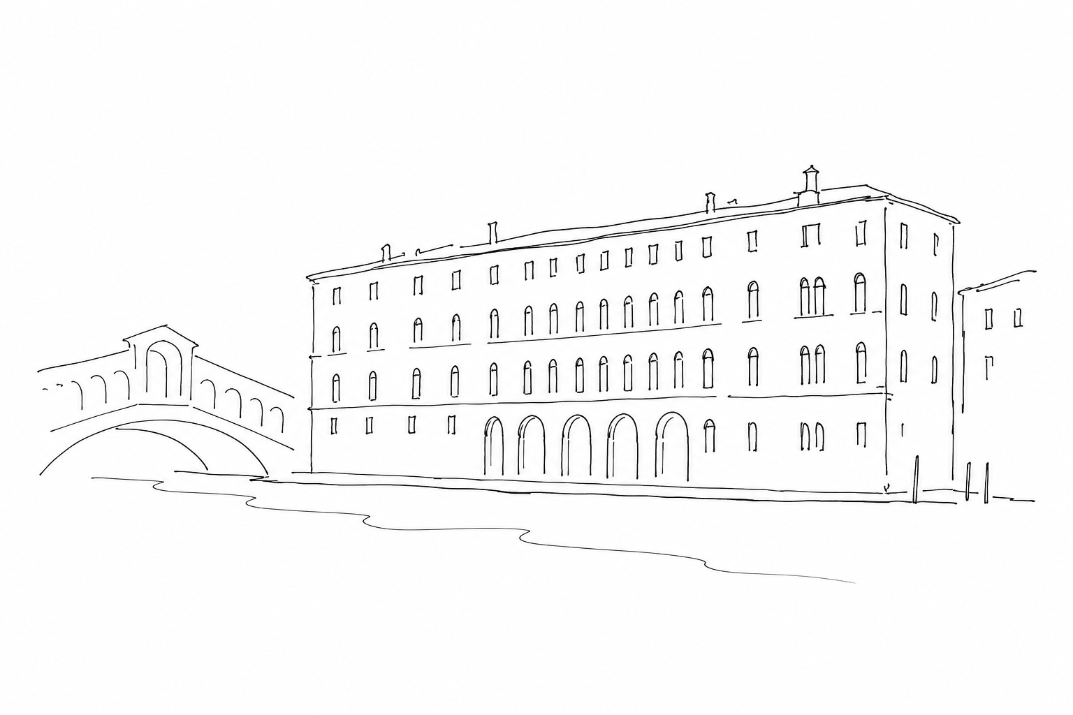
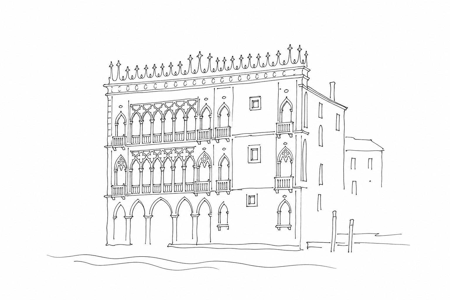
To recognize Venetian Gothic here, one must observe the relationship between solid and void. On the left the façade appears more open, with superimposed windows and loggias; on the right it is more wall-like. This asymmetry does not weaken the whole: it reflects a city where noble representation had to coexist with residential functions, warehouses and direct landing on the water.
The façade as a page: solids, voids and asymmetry
To read Ca’ d’Oro from the Grand Canal, it is useful to start with a simple idea: the façade is not designed like a perfectly regular grid, but like a page in which some areas breathe and others hold the weight of the wall. On the left, the voids dominate: superimposed loggias, perforated arches, slender small columns and parapets make the stone almost permeable to light. It is the most theatrical part, designed to present itself to the water and to the city.
On the right, however, the surface appears more closed. The windows are less dense and the wall retains a more compact presence. This contrast helps to recognize the Venetian language of the fifteenth century: it does not seek abstract symmetry, but balances beauty, prestige and the daily use of interior spaces.
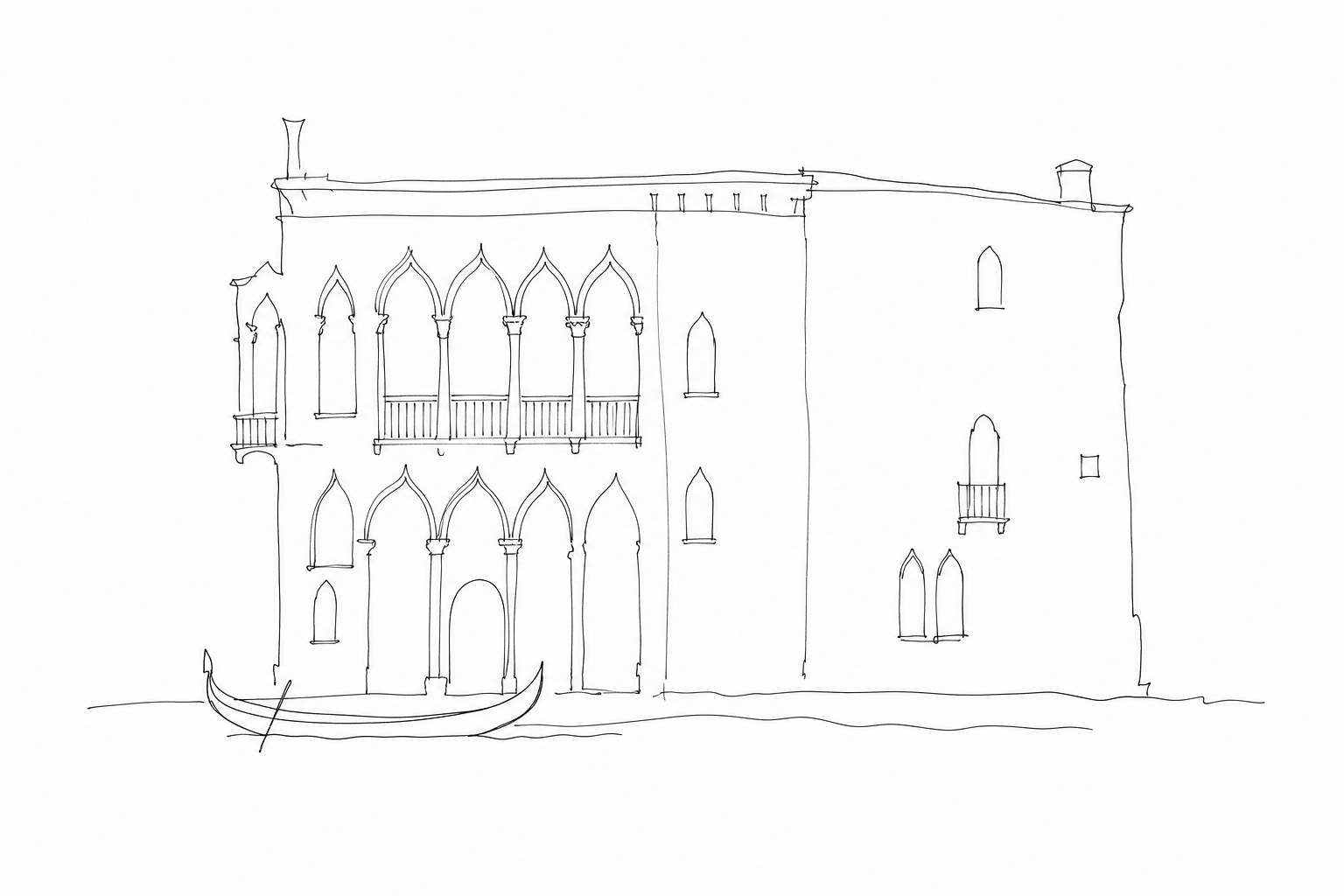
A good method of observation is to follow three levels: below, the landing place and the relationship with the canal; in the center, the piano nobile, where the loggia declares rank and openness; at the top, the light crowning that concludes the façade without weighing it down.
The clues of Venetian Gothic to recognize
Observing Ca’ d’Oro from the Grand Canal, some details help to immediately identify its late-medieval lagoon language. No specialist knowledge is needed: it is enough to follow the forms that lighten the stone and transform the palace into a filter between water, light and interior.
- Pointed arches: the main openings do not have round arches, but slender points. This vertical form makes the design more delicate and accentuates the elegance of the piano nobile.
- Four-light and multi-light windows: the windows set side by side in series create a long perforation. At Ca’ d’Oro the effect of an open wall is clearly noticeable, more like stone lace than a compact wall.
- Slender small columns: they divide the openings without weighing them down. The slim shafts and sculpted capitals indicate measured richness, designed to be seen even from a boat.
- Trefoils and tracery: small lobed, almost floral profiles appear inside the arches. They are one of the most immediate clues of Venetian Gothic.
- Marbles and color: the name Ca’ d’Oro recalls the ancient gilding, now lost, combined with pigments and polychrome stones: the surface was created to vibrate in the light of the canal.
From the Grand Canal: distance, light and rhythm
To read Ca’ d’Oro, it is useful not to seek the close-up detail immediately. From a certain distance, on the water or from the opposite bank, the elevation arranges itself in bands: the low portico, the central noble openings, the more compact masonry at the side. It is precisely this not perfectly symmetrical balance that makes it recognizable.
The advice is to look at the whole first, then narrow your gaze. Follow the line of the floors, count the arches of the loggias, observe how much black the cavities produce compared with the light marble. When the light is raking, tracery, small columns and frames become more legible; when it is full, the effect of a precious surface prevails instead.
The movement of the Grand Canal also helps: the reflections tremble beneath the openings and recall why color, original gilding and different stones were designed to converse with the water, not only with the street.
Recognizing Venetian Gothic in the façade of Ca’ d’Oro means learning to observe Venice with less haste. The openings prevail over the walls, asymmetry becomes balance, the ornamental detail converses with a precise function: to overlook, to illuminate, to represent. From the Grand Canal the palace changes depending on the distance and the hour, showing how Venetian architecture is inseparable from its context. After looking at it this way, other buildings in the city also begin to speak with greater clarity: not as simple stage sets, but as living traces of a history built on water.
Related Posts
Palazzo Pisani Moretta: why Venetian Gothic seems embroidered in stone
A reading of Palazzo Pisani Moretta, where Venetian Gothic becomes a subtle weave on the façade of the Grand Canal.Palazzo Contarini Fasan: the so-called house of Desdemona and the fragile charm of Venetian Gothic
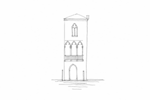
History, legend and Gothic details of Palazzo Contarini Fasan, a small façade on the Grand Canal linked to the myth of Desdemona.
Ca’ Dario: beauty, superstition and dark legends on the Grand Canal’s most unsettling façade
History, façade and dark fame of Ca’ Dario, a Renaissance palace on the Grand Canal among art, famous names and dark tales.Questions Answered
What defines Venetian Gothic architecture on Ca’ d’Oro’s façade?
Its blend of openness, asymmetry, and detailed stone elements shaped by Venice’s environment.Why is the façade asymmetrical and what does it signify?
It balances noble representation with residential and practical uses in Venice’s urban context.Which architectural details help identify Venetian Gothic style?
Pointed arches, slender columns, trefoils, tracery, and polychrome marble surfaces.How does light and distance influence the perception of Ca’ d’Oro?
Light and viewing distance reveal alternating solid and void patterns defining its character.
More places for reading Venetian art
Would you like to continue through museums, churches and palaces without separating works from their neighbourhoods?
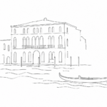 Ca’ Vendramin Calergi: Wagner’s palace and the elegant Venice of the Grand CanalHistory, architecture and Wagnerian memory of Ca’ Vendramin Calergi, a Renaissance palace overlooking the Grand Canal.
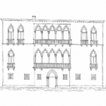 Palazzo Pisani Moretta: why Venetian Gothic seems embroidered in stoneA reading of Palazzo Pisani Moretta, where Venetian Gothic becomes a subtle weave on the façade of the Grand Canal.
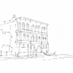 Ca’ Pesaro: why modern art in Venice lives in a palace on the Grand CanalWhy Venice’s Gallery of Modern Art is in a Baroque palace on the Grand Canal: the history, architecture, collections and urban meaning...
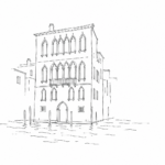 Ca’ Dario: beauty, superstition and dark legends on the Grand Canal’s most unsettling façadeHistory, façade and dark fame of Ca’ Dario, a Renaissance palace on the Grand Canal among art, famous names and dark tales.